Challenge
Create a single source of truth for different teams to use ensuring consistency but also providing flexibility for different contexts
My role
Project lead and UI Designer
What was done
- Workshop moderation
- Brainstorming and concept generation
- Structure for libraries and components
- Project management
Outcome
- 2 new libraries to replace the previous 5
- Speed up designing and prototyping process
Background
As the company goes through growth with new products being launched, teams getting bigger and the Figma organisation initially being based in one separate library of components per vertical and product, after I joined the company I immediately figured that setup was not scalable.
Since I started, the company has released two new products and one entire new health insurance vertical, and in each vertical there are different applications for acquisition, retention and claims processing, each with a different user profile which yields challenges to keep consistency across all interfaces and a smooth and fast design process where components for all applications and systems are easy to find and use.
Problems
- Hard to maintain 5 different libraries before the release of the third vertical and 7 after it.
- With more products to come it would become more cumbersome and error prone to evolve our softwares.
- The existing libraries were built by Creative Design team with focus on Marketing pages, making most components too specific for the acquisition journey pages and in several cases not suitable for the retention application.
Goals
- Define new structure for files and Libraries that is suitable and easy to use for both Marketing and Product.
- Define the system to build the libraries and components.
- Simplify maintenance.
- Enable easy scalability.
Process
The company organisation has a Design Team as part of the Product department and a Creative Design Team that is part of the Marketing department. Before I joined the company both teams used to work separated and as the Creative Design Team is bigger, having been there longer, it was a natural consequence that the libraries reflected Marketing department setup and needs for design work.
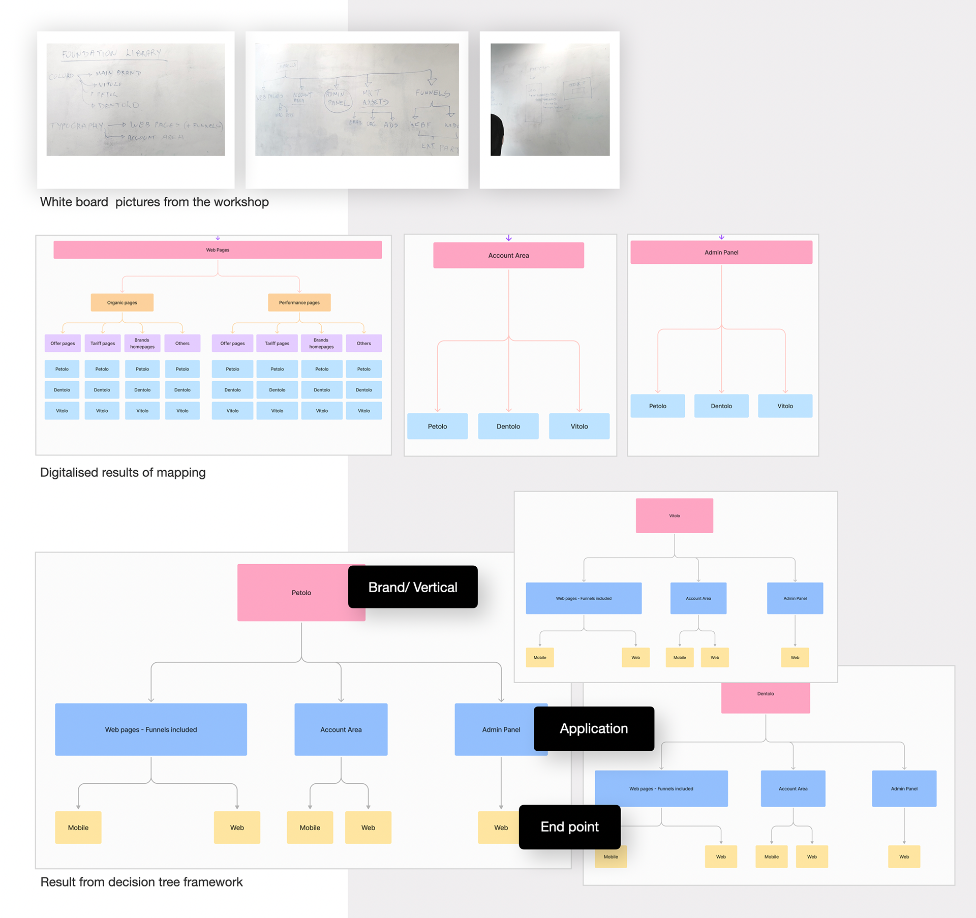
My first action for this project was to align with the Creative Design Team about the challenges and how we could address them. Therefore, I started organising a workshop where I used the Decision Tree Framework to guide us as a group to identify all interfaces we have, understand and define a logic to group them and then agree on how to build the design libraries accordingly.
The workshop started with mapping the company's portfolio and developing naming conventions that eded up considering that in our set up we have an umbrella brand and all verticals are sub-brands: Dentolo, Petolo and Vitolo as variations of each group of interfaces, that we agreed to name as “applications”.
The so called applications have different interfaces that are connected on the backend, and we defined them as the following:
-Web pages: homepages, Landing pages and others built in Webflow
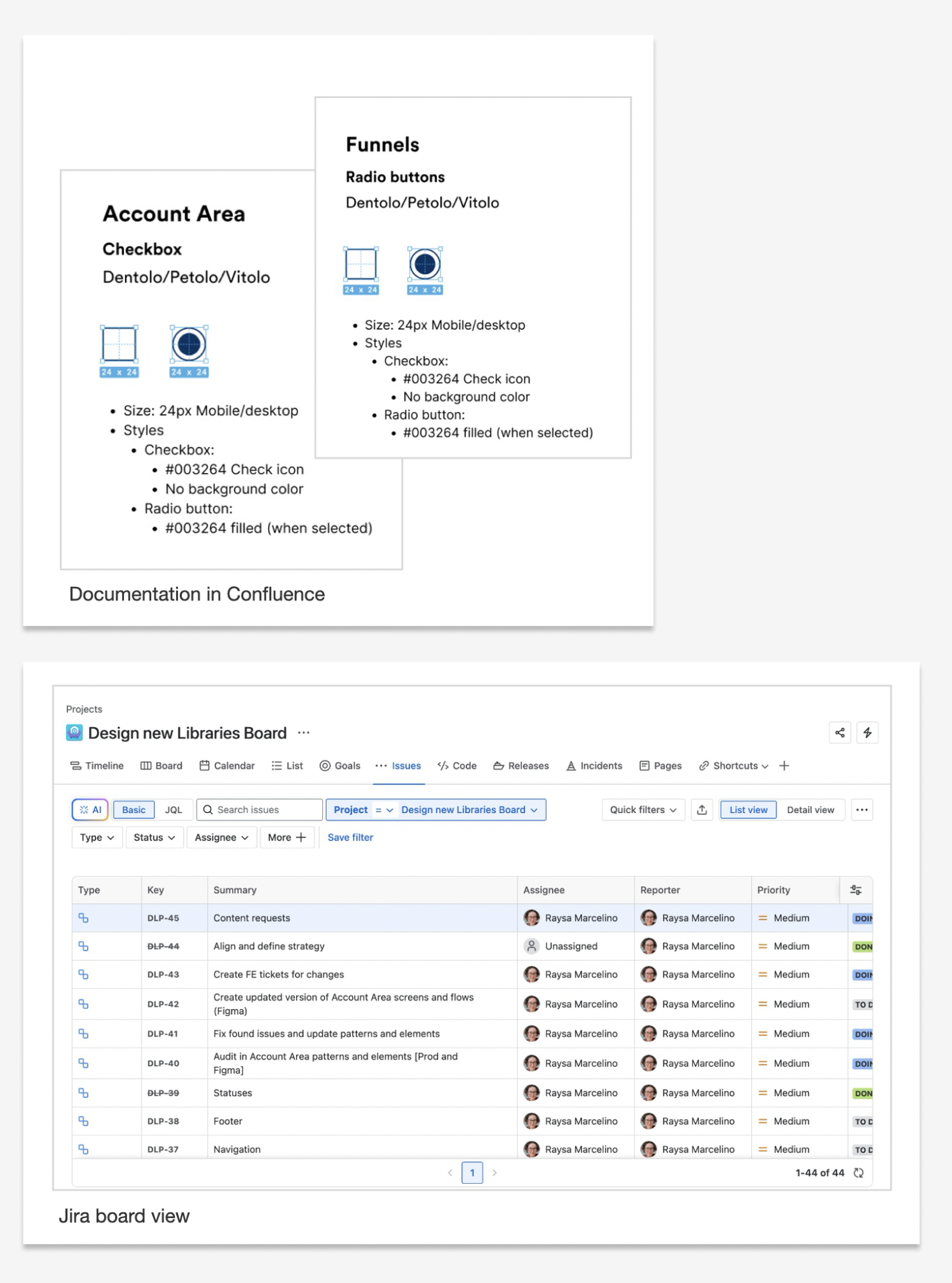
- Funnels: online conversion application that is embedded in webflow and provides flexible widgets to collect data, calculates tariffs and creates customers in our system
- Customer Account Area: online portal for customers to log in and access insurance, file claims, and view status updates
- Admin Panel: Internal platform that manages contracts, payments, process claims, calculates reimbursements and generate payouts
- Performance assets: assets for email marketing, ads and others in general that are related to acquisition performance.
From the mapping we then focused on the customer interface applications first and as some interfaces have their elements coming from different sources, we decided to consider common elements and what needs to be brand related to simplify the grouping and the creation of the new libraries.
Based on the analysis of what is common and what needs to be separated for each one of the applications, we decided to have two libraries for all sub-brands and organise them in specifics hierarchy that will make easier for us to use them:
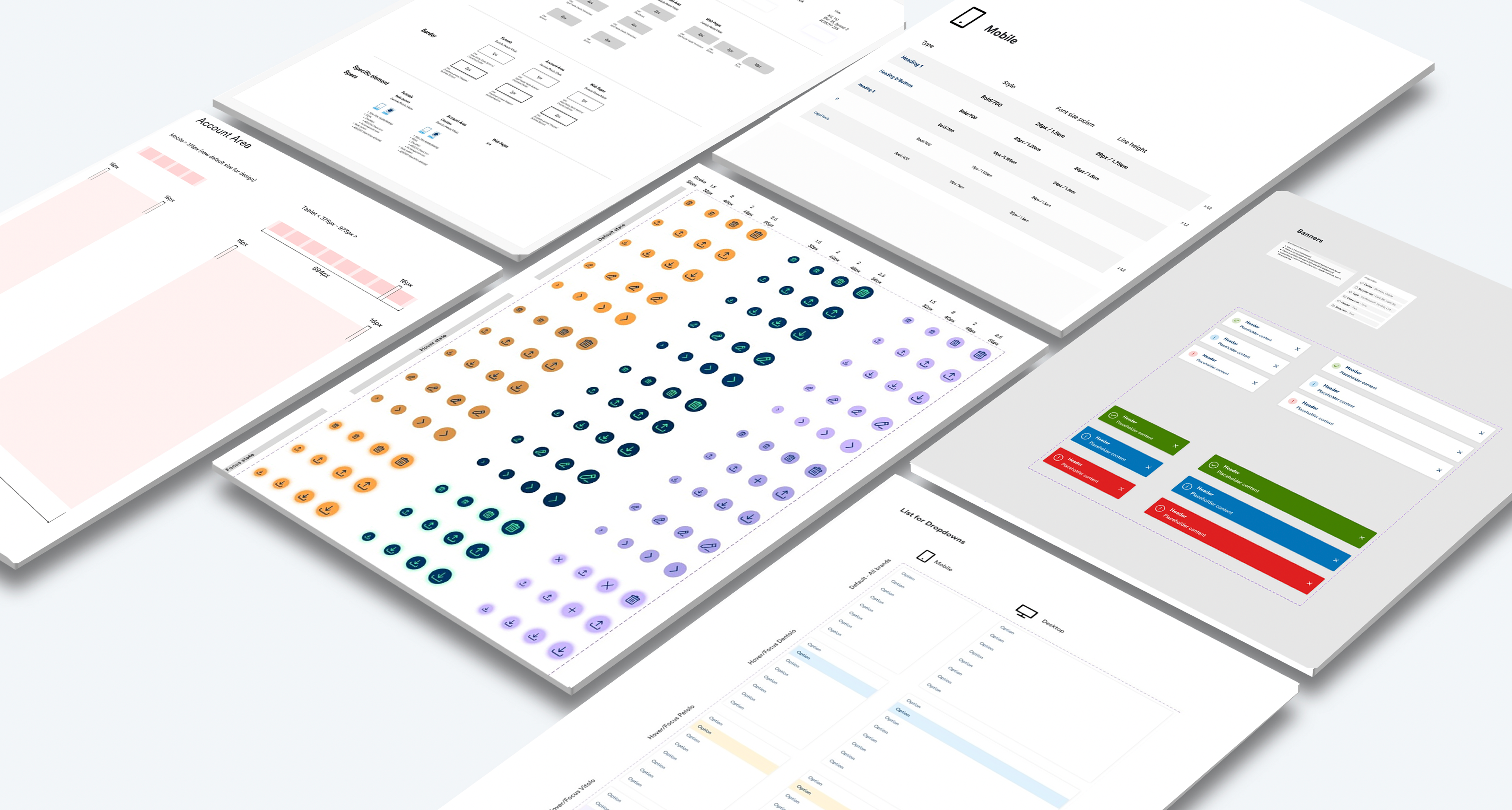
Foundations Library
Aggregates the constant elements used in all interfaces regardless the brand and application:
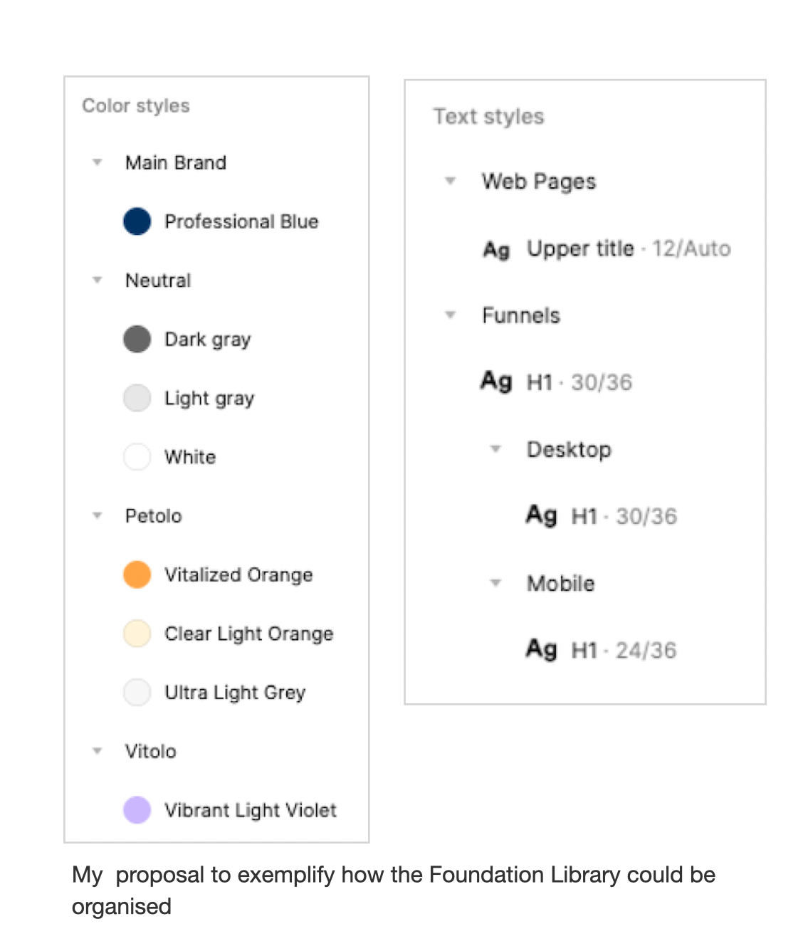
Colours - having sub-brand specific colours and some colours used across all sub-brands (like the Professional blue #003264 and other neutral colours).
Texts styles - despite using the font family Circular TT in all interfaces, they are applied in different sizes and weights.
In order to have proper consistency and enable us designers to use the same source when building projects the elements were organised and grouped following an hierarchy:
-Colours (Higher level)
- Sub brand specifics (Lower level)
- Used in all sub brands (Lower level)
Typography (Higher level)
- Text styles separated by application (Lower level)
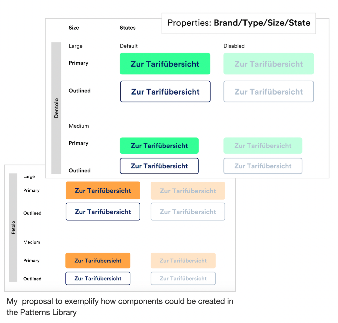
Patterns Library
Contains the design patterns for every application, with variations according to each sub brand to allow us to create components based on the patterns, and adapt them automatically to each sub brand.
The organisation also follows an hierarchy where patterns are created based on application, each application has its own patterns and patterns have variations for each brand as needed.
Once we defined the two libraries scope and structure to organise elements and components based on our context, the next step was to organise the execution process.
The project would touch all customer interfaces in different applications so all designers from both Marketing and Product Department would need to work close together, especially for the Foundations Library that would be the common source, therefore I needed to coordinate the execution the process that was based in 4 steps:
1. Map
2. Align
3. Define
4. Apply
The organisation of this process happened with the creation of a Jira board with both design team members, tasks created for the mapping stage and assigned to different people, tickets and slack channel for alignment and communication, documentation using Confluence, and one meeting to define all patterns to be used across all interfaces and what need to be application specific.
After definition of everything in Foundations Library we created all the styles and guidelines needed and used them to build the aligned patterns that would compose the Patterns Library.
The last step of the process was the onboarding of engineers, PMs and other stakeholders in the new set up and libraries files.
Outcome
As result we now have two libraries that organise colours, typography, spaces, alignments and styles in one place, and consistent and flexible patterns and components that are being used by all designers, enabling the design process to update screens and create new features faster with no mistakes due manual work, which also results in a faster process to implement and deploy changes in production and enable the designers to have more time to focus on delivering more user friendly solutions.
I took the lead on this execution process ensuring that every team member's individual work style was respected and while I provided direction and support, each designer worked independently to build a solution that was no longer solely driven by marketing objectives which enabled Product Team to work more effectively.
Learnings
Overall, this project not only improved workflows across different departments but was also a rewarding experience and achievement for me professionally as it allowed me to build a bridge between Design teams that, while operating in separate departments, need to stay closely aligned to ensure a consistent user interface and experience.