Challenge
Improve conversions and performance while also including the rebranding changes to adapt and follow new guidelines from headquarters.
My role
UX Designer within CRO team
What was done
- Research and analysis
- New concept
- A/B test
- Final Design
Outcome
- Bounce rate decreased in more than 30%
- Conversion - clicks on the CTAs increased more than 10%
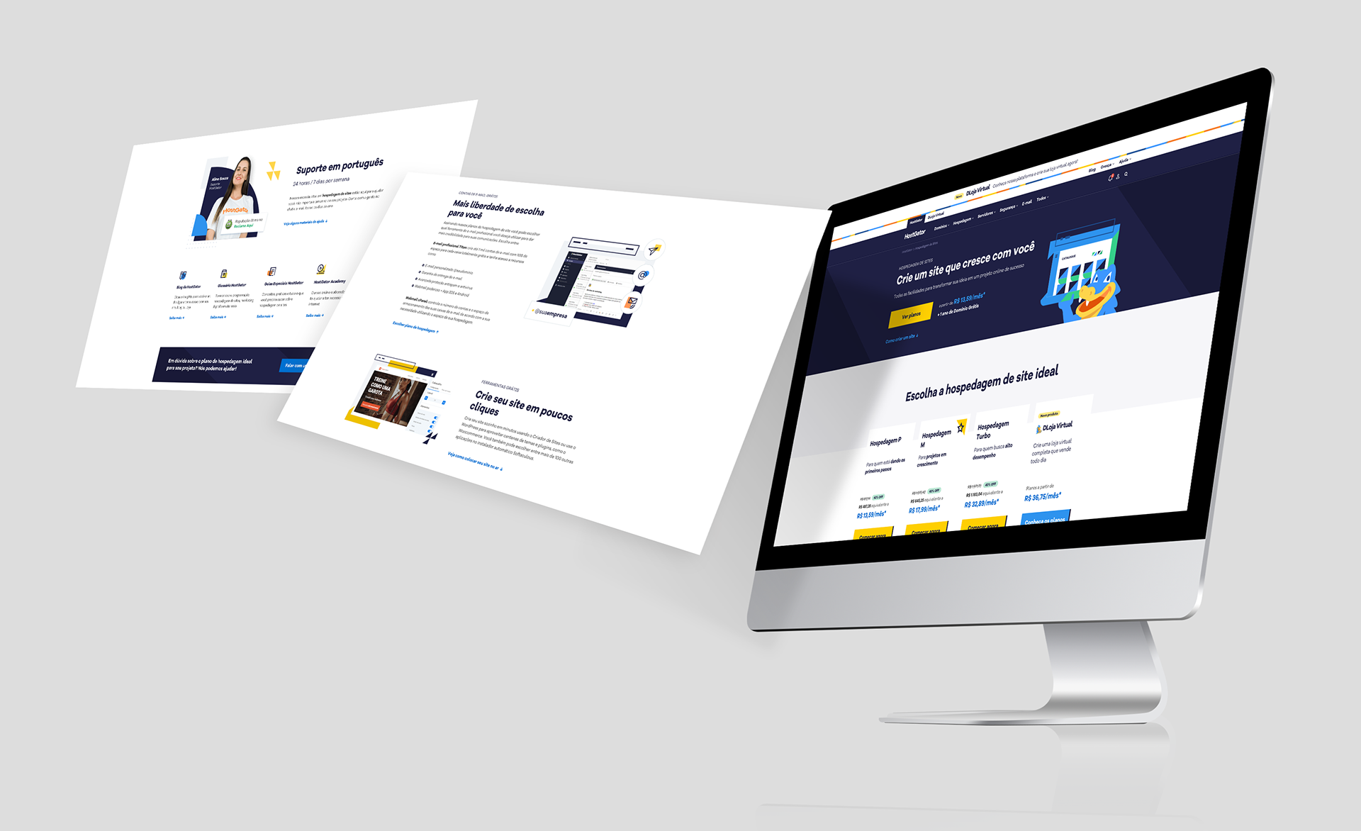
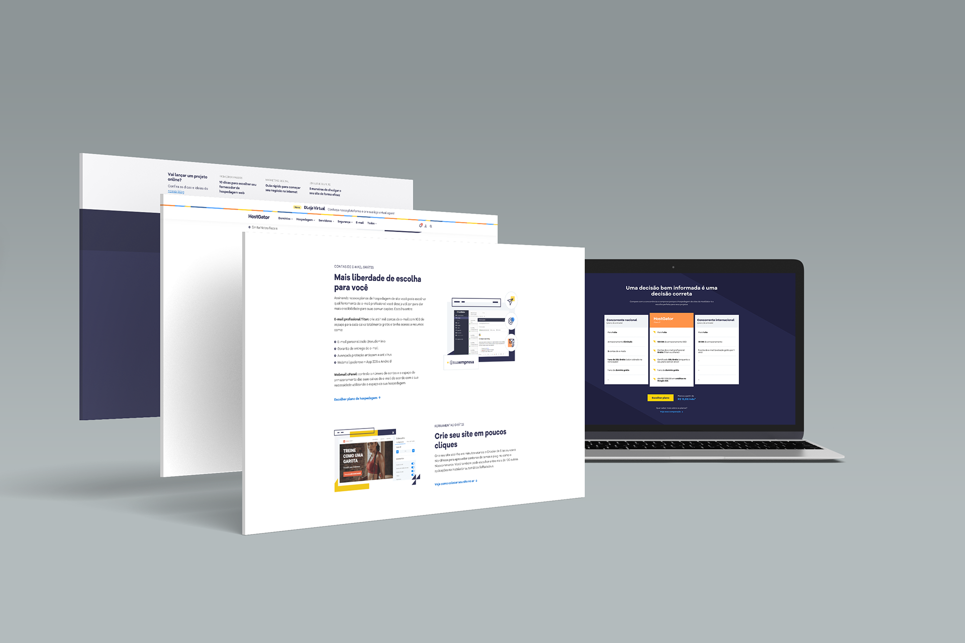
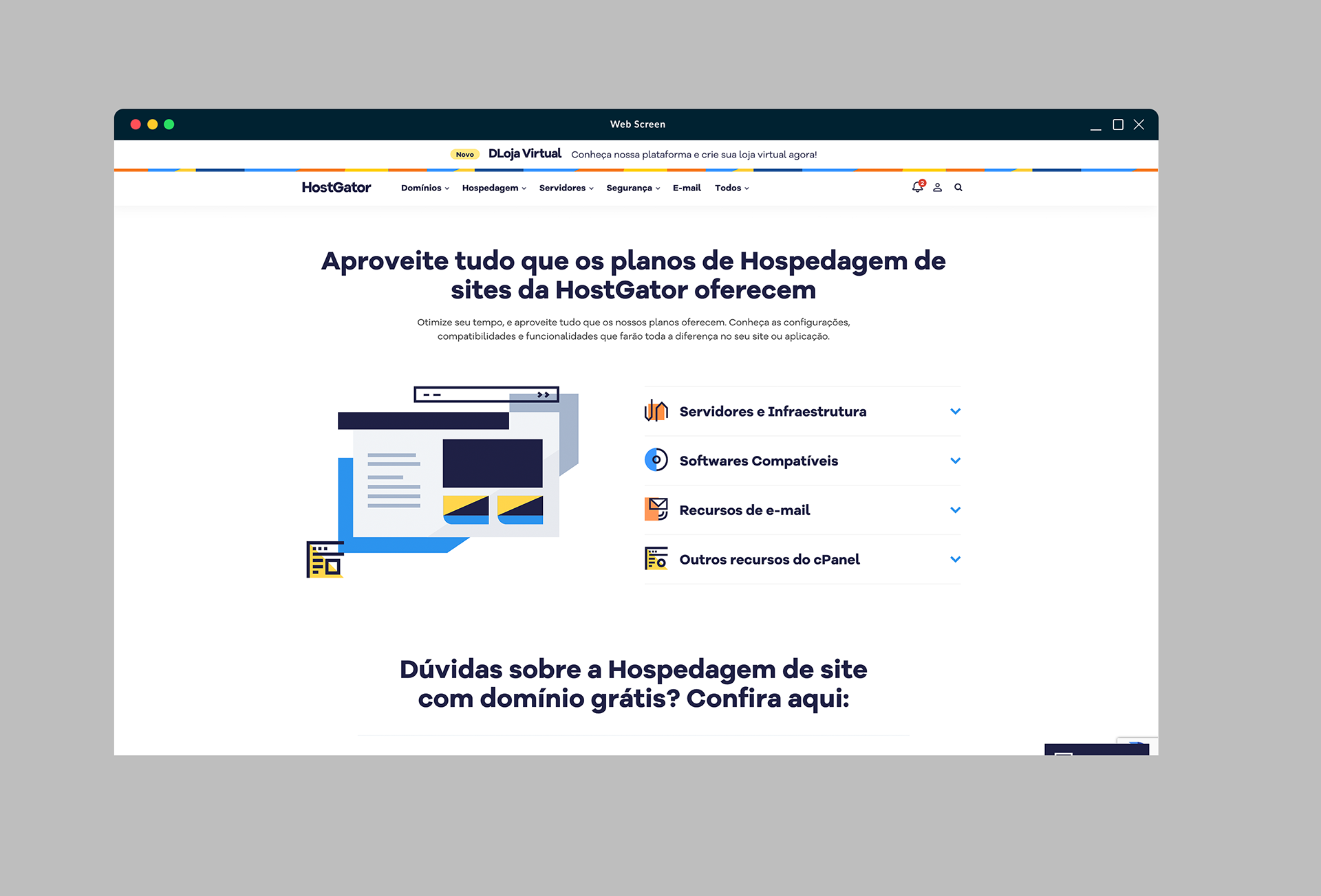
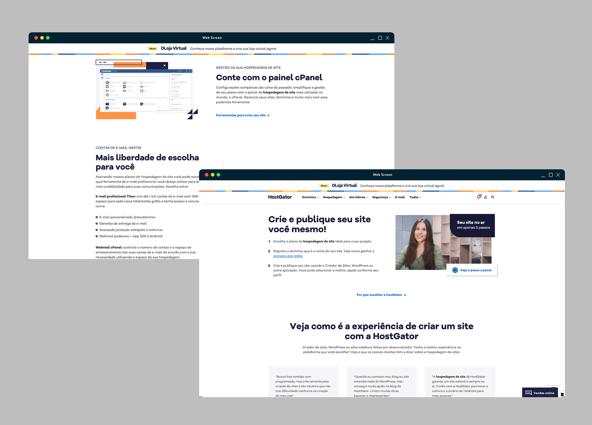
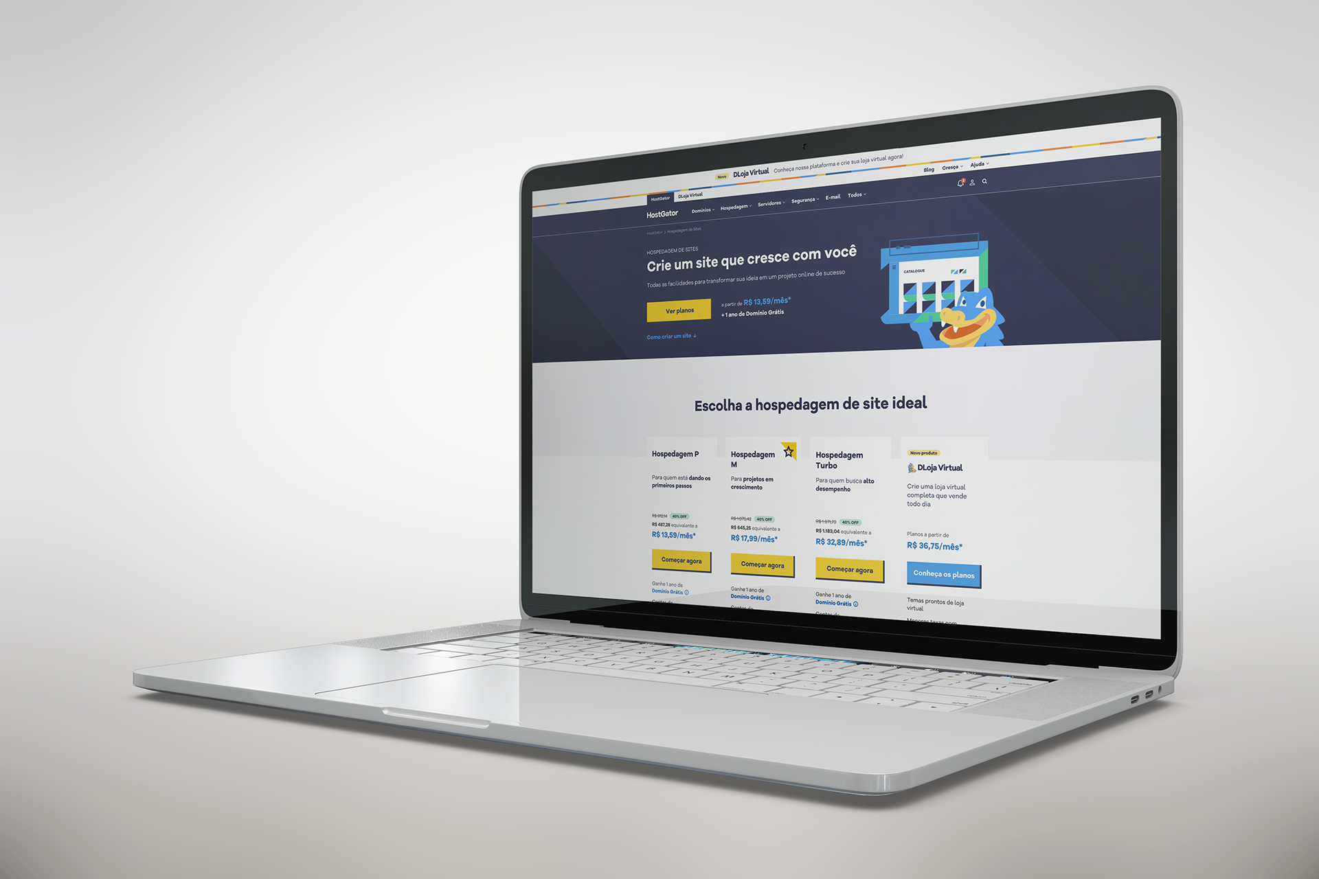
Final design
Process
What was the page
The e-commerce website consisted of different product pages related to web hosting, each requiring a redesign to adhere to the rebranding initiative and also to properly present the product itself to users.
Problems
To start, we as CRO team identified performance issues through data analysis with tools like Hotjar and Google analytics such as:
- Low scroll rate: around 80% of the traffic was seeing only 25% of the page
- Low conversion: low number of clicks in the CTAs to proceed to the next steps of the journey considering the traffic
- High bouncing rate
- Time spent on page was also really low
We also planned and executed qualitative research by moderated interview with users navigating through the page where we asked questions to identify their perception of the page, and through this we identified that:
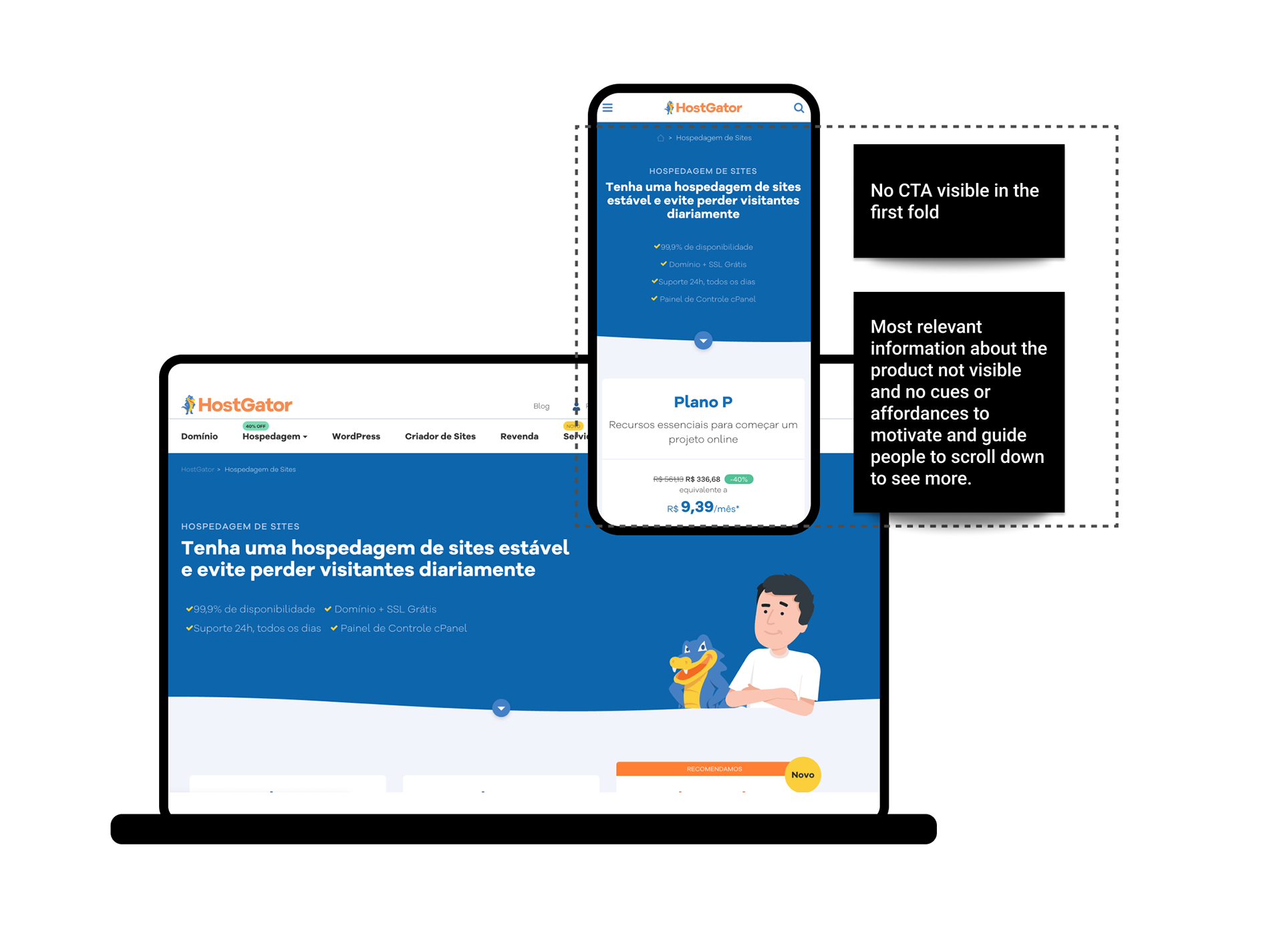
- The first call-to-action (CTA) was below the 1st fold on both mobile and desktop view.
- Most of users were not scrolling down the page and only seeing the header because was not clear for them in the 1st fold that there was more to be seen below.
Some people thought there was nothing but the text information and illustration on the 1st fold and nothing else in the page, and used the menu to navigate and the search to find information.
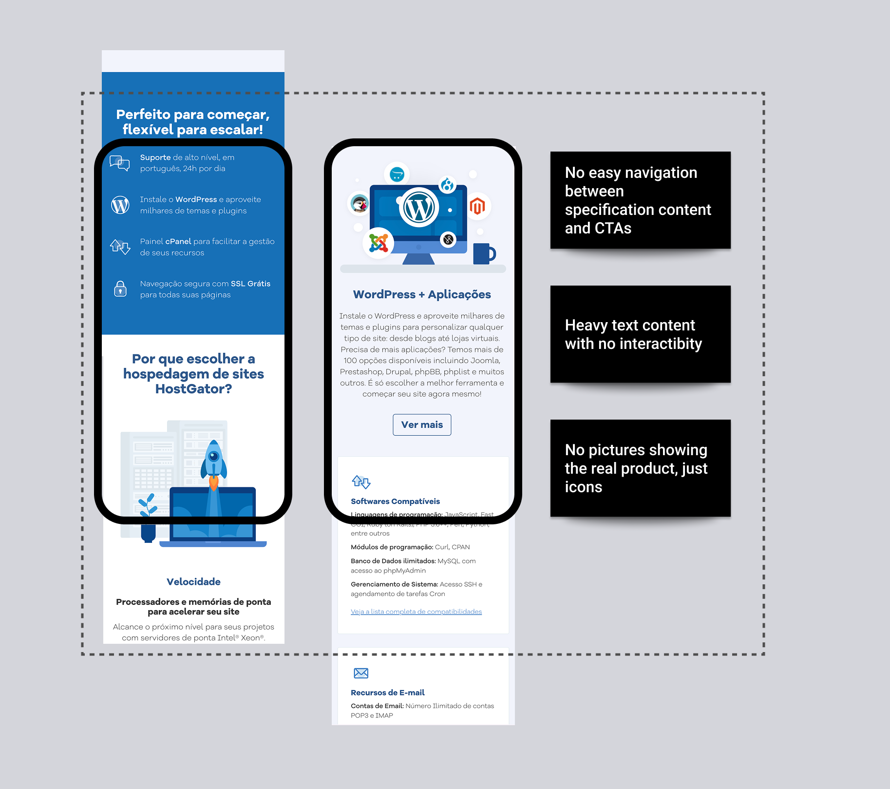
With this information, we realised that most relevant information about the product and the CTAs were not being seen and it was not intuitive for people that there was more information below the page, as we were using a lot of space with text and illustration but not giving cues or affordances to people to scroll down and see more.
Solution
Before jumping to a final solution including the new brand visual guidelines we decided to develop a LP with the current design to have data to back up the final design changes for the final page including both redesign for new brand guidelines and fixing the problems that were likely causing conversion and performance issues.
The LP had the following:
- CTA in the 1st fold for both mobile and desktop to make sure users will see.
- Added anchor links after each section of content to motivate and facilitate scrolling therefore users would easily see more content of the page.
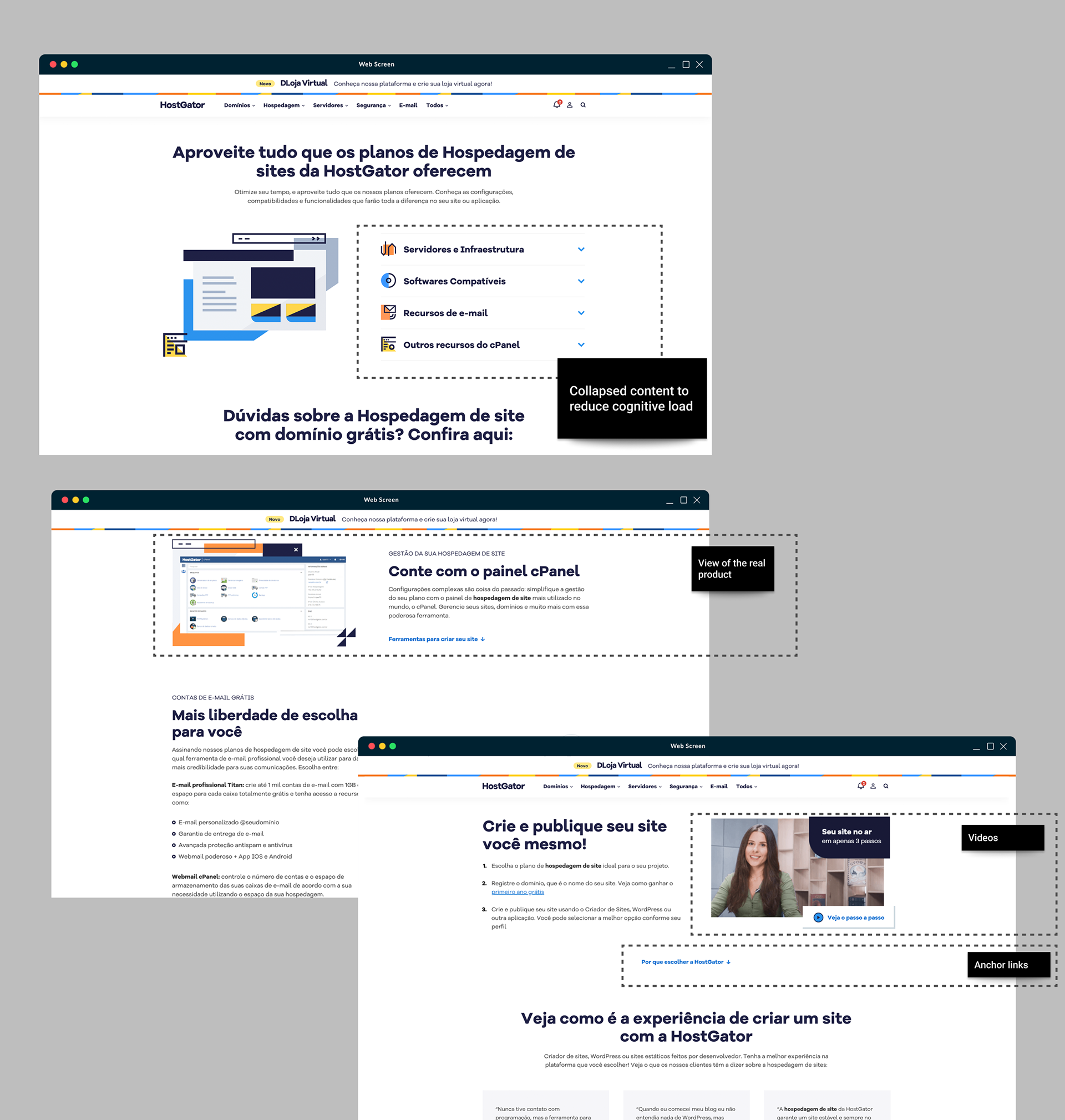
- Added videos alongside with text content about how the product worked to see if users would click to watch and spend more time on the page to learn and make informed decisions when buying.
- CTA in the 1st fold for both mobile and desktop to make sure users will see.
- Added anchor links after each section of content to motivate and facilitate scrolling therefore users would easily see more content of the page.
- Added videos alongside with text content about how the product worked to see if users would click to watch and spend more time on the page to learn and make informed decisions when buying.
Note: Unfortunately I could not find the aforementioned LP to show images of how it looked like.
A/B test
After waiting a few weeks with the LP on production and checking performance, we compared the data and the variant with the new approaches had higher conversion rates and engagement, then with this data we were confident and I started the redesigned page applying new brand visual guidelines alongside a whole new approach based on the findings from the A/B test.
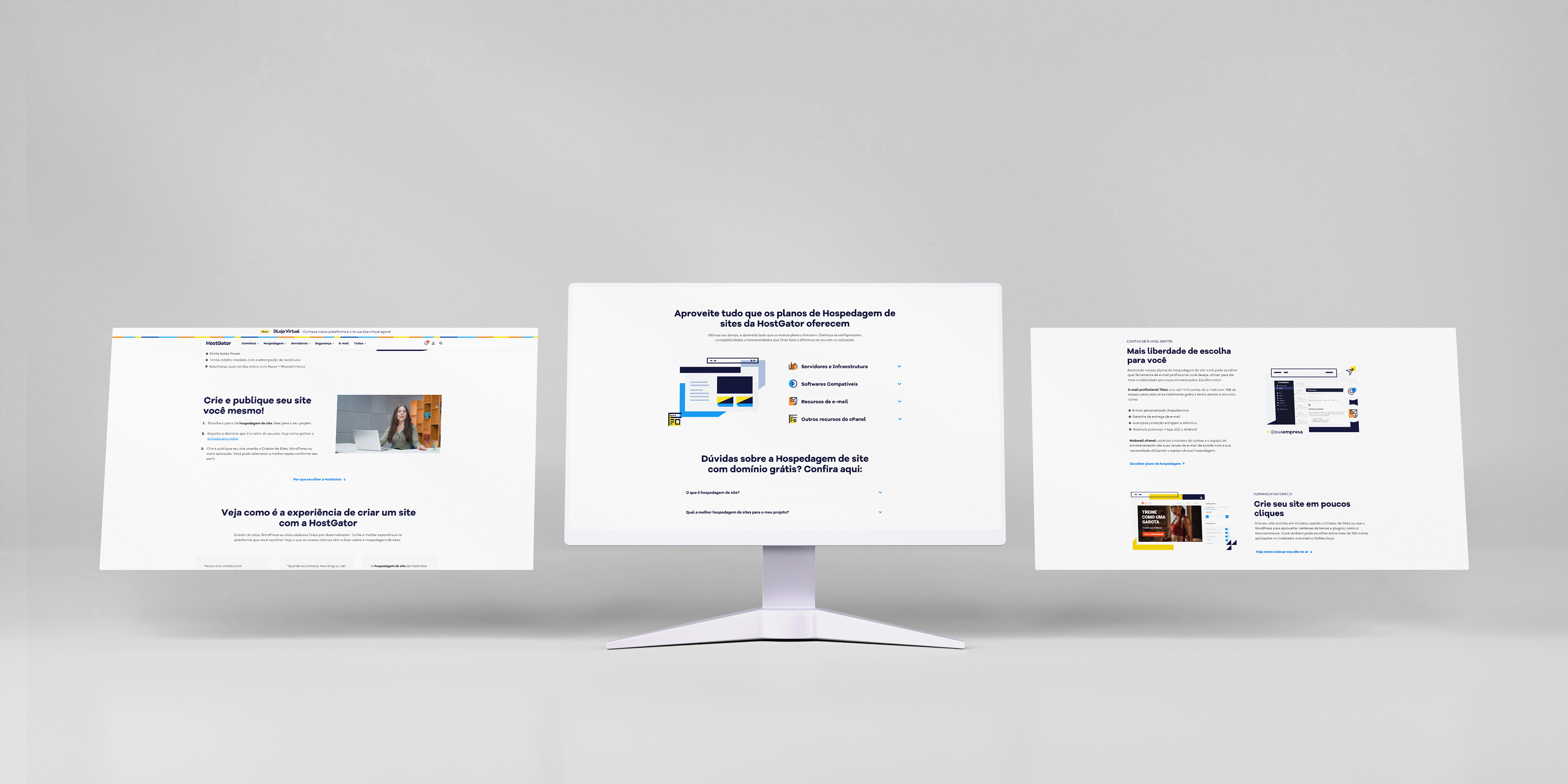
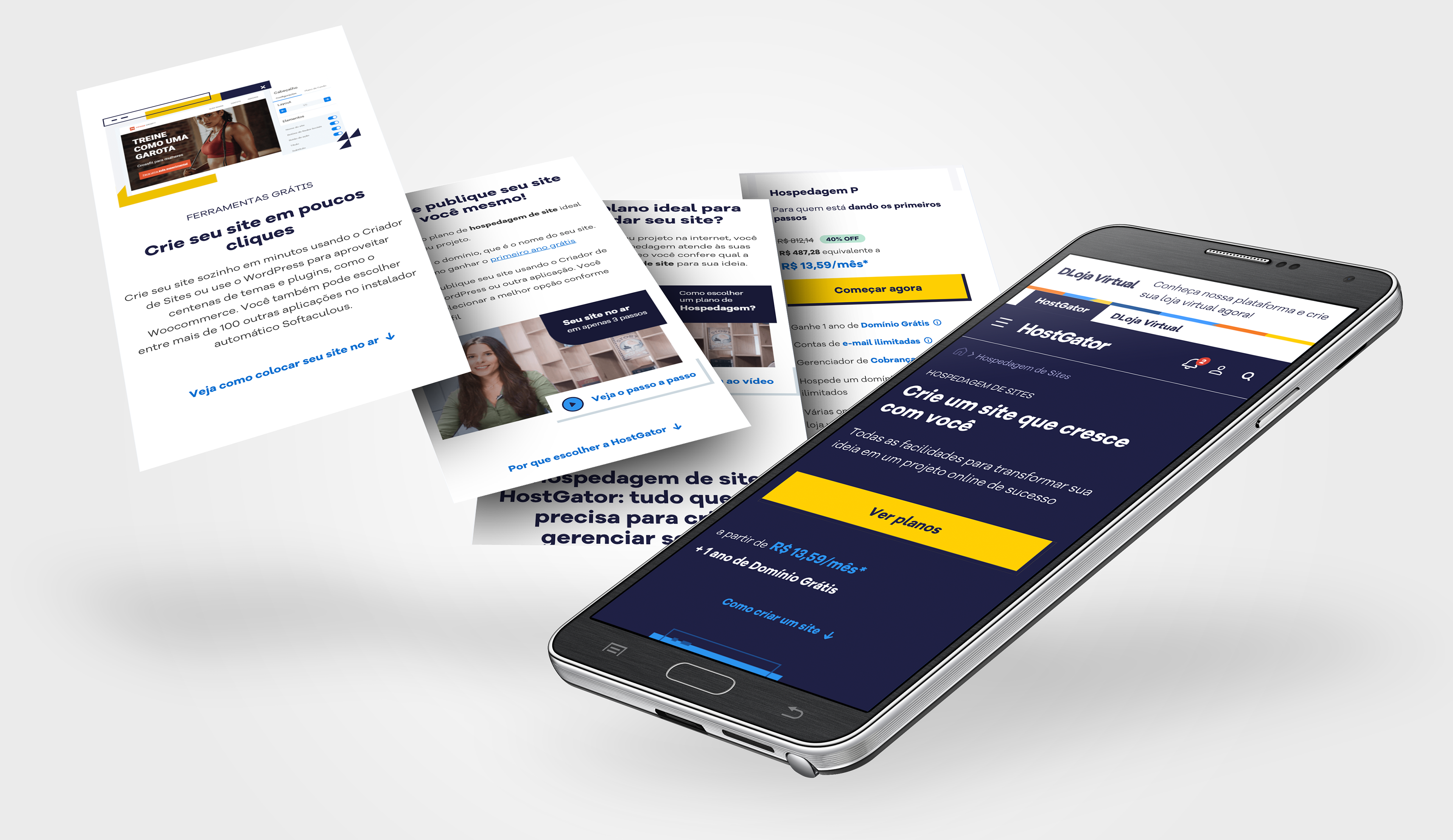
Final Design
Combining all findings and focused on performance I defined the changes:
1. Hero Section with Main CTA
The hero section was redesigned to feature the primary CTA prominently in the first fold of the page, ensuring its visibility and accessibility to users.
The hero section was redesigned to feature the primary CTA prominently in the first fold of the page, ensuring its visibility and accessibility to users.
2. Anchor Links for Navigation
To facilitate content navigation, we implemented anchor links within the page, enabling users to jump directly to relevant sections. This improved user engagement and overall usability.
3. Condensed Content with Expandable Sections
To decrease cognitive load, I condensed certain sections, initially displaying them in a collapsed state but also provided clear UI cues, such as clickable elements, to allow users to expand and view additional details as desired.
4. Incorporating Videos
Building on the LP's success, I introduced videos to the web hosting page. These videos, featuring individuals explaining and demonstrating the product with real-life examples, enhanced user engagement and comprehension.
5. Real Interfaces
We adopted a more visually appealing approach to showcase real product interfaces with the new brand visual guidelines therefore I created a way to present them creatively to capture users' attention and improve their understanding of the product's features.
6. Changed Content Order
Following the successful LP approach, I reordered the content to present the most relevant information first. This approach captured users' attention early on and improved their understanding of the product.
Following the successful LP approach, I reordered the content to present the most relevant information first. This approach captured users' attention early on and improved their understanding of the product.
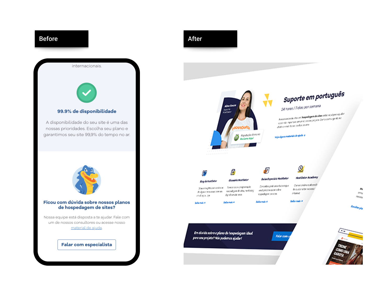
7. Improved Social Proof
To enhance credibility, I added social proof by displaying the company's score on a prominent Brazilian review and evaluation platform. This inclusion bolstered user trust and confidence in the product.
Outcome
Final result performed really well after released considering the success metrics:
- Bounce rate: Decreased in more than 30%
- Conversion - clicks on the CTAs: increased more than 10%
And as conclusion I would say that as in real life, the process was not linear and there were several variables involved but still with constant alignments with stakeholders and other team members it makes much easier to achieve the desired results.
More images of the final page below: